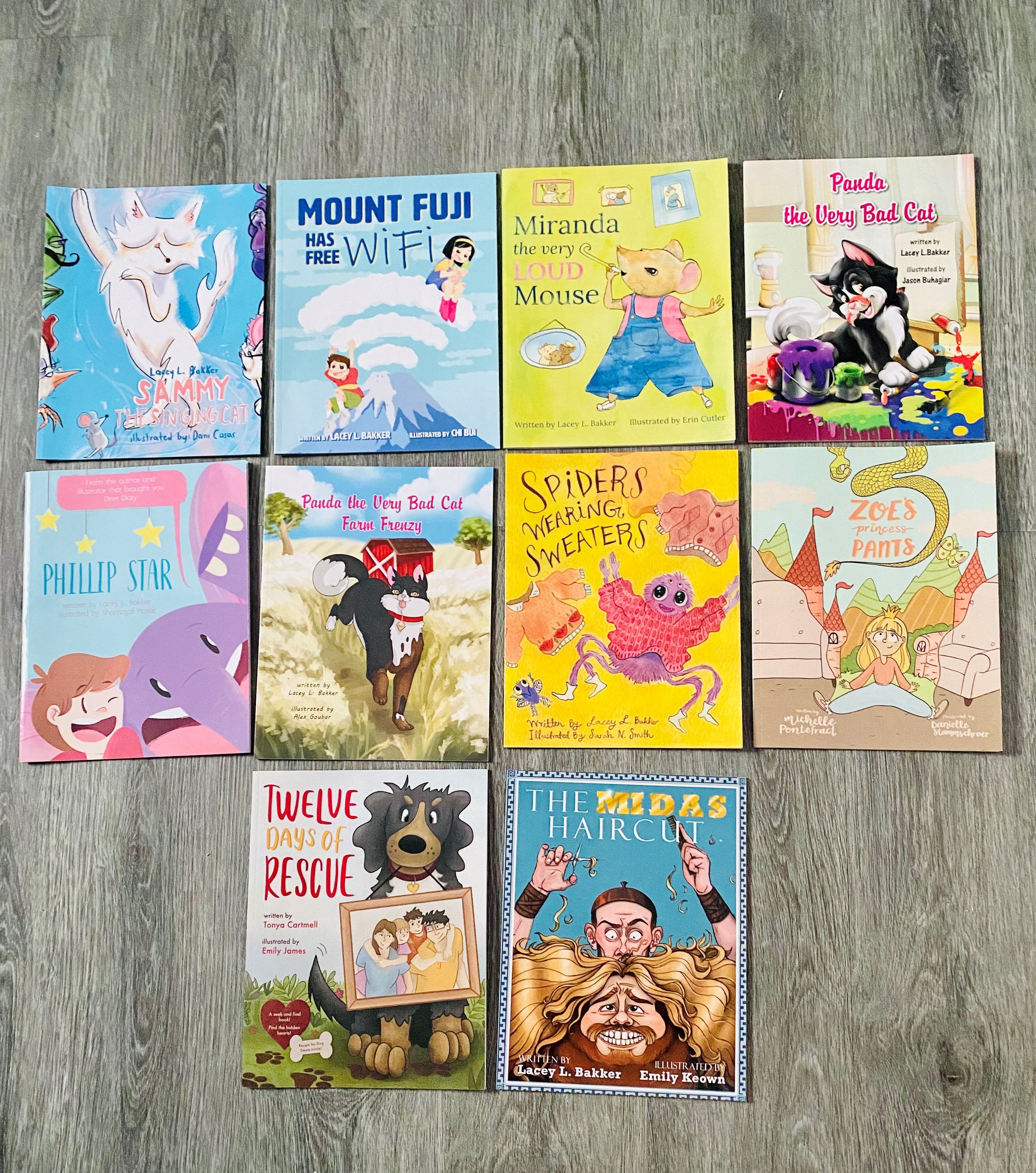
May 10, 2021– Today, we’re talking about the importance of covers on children’s picture books. Let’s dig into some marketing! The cover is the FIRST point of contact that you have with your prospective reader. The cover is what draws them in and entices them to pick up the book and show it to their parents (picture books ages 3-7) or turn it over and read the back (middle-grade and YA ages 12-18). We’ll save the mid-grade and YA for another post.
Children’s Picture Book Front Covers:
- Bright and Colourful. Children are naturally drawn to colours that are bold and stand out. Colours like purple, blue, and pink are colours that are a lot more uncommon in nature and thus stand out more. This goes back to our reptilian brain and the need for survival; food that was blue, purple, and pink was uncommon and therefore is noticed by humans more often than other colours (taken from my background in Consumer Neuromarketing and Neuroscience).
- Big Font. It needs to be easy to read and give the reader an idea of what’s inside and who the story is centred around, e.g., Panda the Very Bad Cat, The Extreme! Supreme! Dogwalker Darlene!, Carlos Goes on Vacation, The Celestial Squid etc.
- The Protagonist. The main character is who kids root for; it’s the hero of the story. There is usually a picture of the protagonist on the front cover, e.g., Curious George, The Paper Bag Princess, Sammy the Singing Cat etc.
- Author and Illustrator. In a smaller font, usually near the bottom of the book or off to one side, is where we find the author and illustrator names, not because they aren’t important, just because kids aren’t usually interested in the nuts and bolts of who wrote the book or illustrated it.
Children’s book back cover:
- Blurb. A few sentences about the story, the character, or the plot. This needs to be very exciting and pique the reader’s interest. We often phrase the back of the book blurb as a question; for example, here’s what the back of my book Panda the Very Bad Cat Farm Frenzy says, Panda is back on the farm! Will he be up to his old tricks of causing chaos and mayhem, or will the farmer be able to keep him out of trouble? This is an adventure that you won’t want to miss! This is a good example of getting the reader intrigued enough to find out what happens and if the farmer DOES keep Panda out of trouble or if Panda wins again!
- Clear Font. Again, readability is key. Don’t do anything fancy or in cursive writing; make it legible.
- Colour Scheme. Tie in the colours from the front to the back so that it all fits together. I don’t love it when there are a bunch of different colours on the back of the book that clash with the front. The entire cover should work together as a whole. Feel free to include a cute supporting character such as a mouse, a dog, or whatever other object makes an appearance in your book. Pick one, too many can be visually overwhelming.
- Include Social Media. This is where your website should go, email to where the reader can get ahold of you, and anything else you want to include, such as social media info (Facebook, Instagram, Twitter etc.), but be sure to keep it all in one space in the corner as not to take away from any elements of design or the message of the book.
As you can see, covers for kids’ books are essential. Have fun, be bold, and get creative! To check out our collections of kid’s books click here: Products – Pandamonium Publishing House